7 Tips For More Professional Typography

Many people have had some kind of experience using Photoshop and a small number of those people grow to excel in graphic design. An even more minute group understands the principles of design and can tell you the reasons behind why something looks good or bad.
One of the biggest areas that people struggle with when learning design is the proper use of typography. It's much more than just finding a good font. There are many attributes including color, size, weight, leading, tracking, padding, and more.
Good use of typography can make or break a design and take your piece from amateur to great or from great to unbelievably fantastic. In this tutorial we will take a quick peek at how you can make your work look more polished in just a few steps.
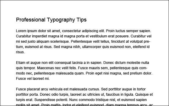
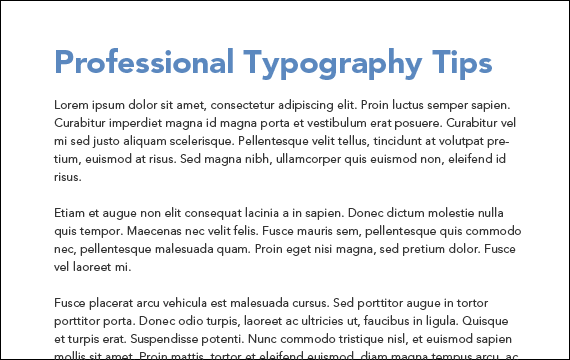
What Is Wrong With This Picture?
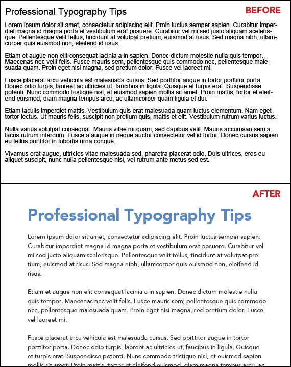
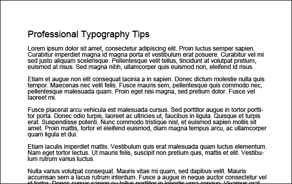
Let's start with what most aspiring designers would create if asked to make a simple heading and a few paragraphs of text within Photoshop or Illustrator. To the untrained eye, it looks neither good nor bad, it's just there, but do you want to create a design where the text is "just there"?
Someone with experience in typography and design would tell you that the text lacks hierarchy and breathing room, among other things. So what do we do to make it look better?
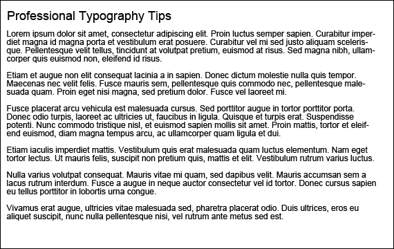
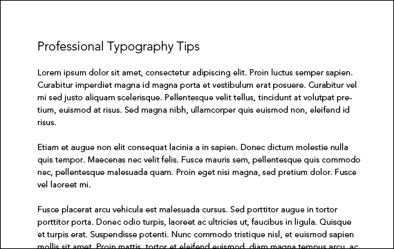
Padding and White Space
The first step is to give the whole block of text some padding. Padding is the area of empty space around the edges of a block of text.
By leaving some blank space around the copy, we are giving our readers a chance to rest their eyes between lines or sentences, which makes reading the text a much less daunting task.
The purpose of designing typography, in many cases, is to improve readability. After all, what good is all that text if it isn't getting read?
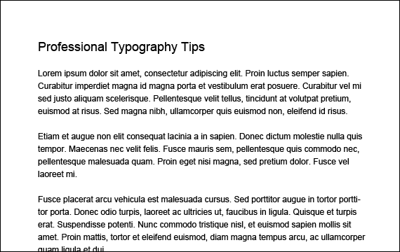
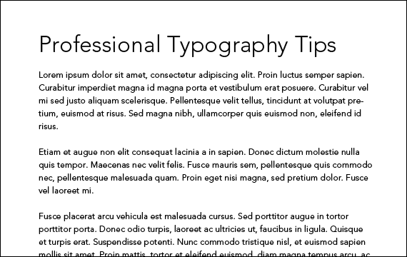
Leading and Line Spacing
Another way to make your text easier to read is to increase the line spacing, or leading. Leading is just a fancy way of describing the amount of space between lines of text in a paragraph.
Having a good amount of leading makes it easier to move from line to line as you read. A good rule of thumb is to multiply your text size by 150% to set your leading.
For example, if you have 12pt text as we are using, a good starting point for your leading, or line height, would be 18pt. It's all basic math, 12pt x 1.5 = 18pt.
Leading, along with the other settings mentioned in this tutorial, can be changed within Photoshop or Illustrator within the Character palette, which you can display by clicking Window > Character in Photoshop or Window > Type > Character in Illustrator.
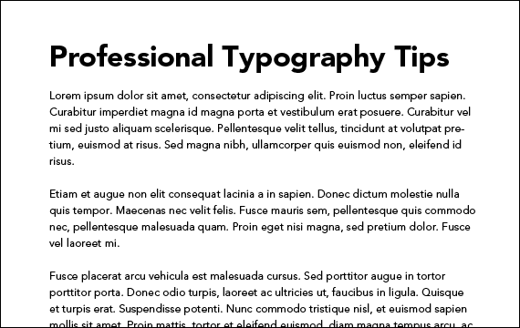
Tracking and Letter Spacing
It's already looking a lot better, but there is more to do if you want your typography to look its absolute best.
By default, the letter spacing within many fonts is not optimized for readability. Often times, letters are too close together when spreading them out would make them easier to read. The space between letters is also called Tracking.
Tracking is not to be confused with Kerning, which is the space between specific pairs of letters.
We only slightly increased the Tracking in our document, but it adds to the readability and presentation of the text.
Typeface and Font Selection
Many people skip tips 1-3 and go straight to this one, which is font choice. There are hundreds of thousands of different fonts out there so it can be hard to choose the right one. Let me start by saying that the vast majority of free fonts are poorly constructed and just plain ugly.
Don't be afraid to rely on the recommendations of other designers whose work you know is universally respected.
Below is a list of some of our favorite font resources, both free and commercial:
You can also find a few good lists of fonts from other designers including The Top 100 Best Fonts Of All Time.
In our example we started with Arial and have now switched over to Avenir, a clean and simple typeface designed by Adrian Frutiger.
By the way, do yourself a favor and delete Comic Sans from your computer. We like to think it is the wrong choice in every situation.
Font and Text Size
Another way you can create hierarchy between your headings and paragraphs is to alter the size of the text.
A good rule of thumb here is for your headings to be 2-3 times the size of the paragraph text. So since our paragraph text is 12pt, we made our heading 32pt or 2 2/3 times bigger than our paragraph text.
Font and Text Weight
Though not always necessary, changing the font weight can aid in readability by breaking up the page into more digestible chunks. Particularly online, people scan documents more often than read them completely, so you want to make it easier for them to skip to the sections that they are interested in.
This is done by distinguishing the heading of each section from the body copy that accompanies it.
Color and Contrast
Black text on a white background is good, but colored text on a white background can be better.
Contrast is often a tough nut to crack. Too much of it can hurt the eyes of the reader after a long period of time. Too little contrast will force the reader to strain their eyes just to read the text.
Dark gray text is much easier on the eyes than black text when placed on a white background. It may not be immediately noticeable, but your eyes will thank you after 10 minutes of reading.
Besides avoiding strain on your eyes, changing the color of headings can also make them easier to spot. Even using a muted medium blue like we did makes a huge difference.
People subconsciously see black as boring, which is not what you want to be...I hope.
Adding even subtle colors will make your typography better looking and more professional.
Experiment With Your Own Rules
I can't stress enough that the tips above do not apply in all situations. They are basic rules that are great for basic typography, but we all know that rules are made to be broken.
Our first tip mentioned that adding padding to your text is the way to go. The examples below demonstrate that this is not always the case.
They are dramatically different, but both look good. This is where you come in.
With experience and experimentation, you will begin to learn what works and what doesn't.
Some of the most amazing designs you will find ignore these rules completely, so use them as a starting point when you want simple, easy to read text that also looks good.
Before and After
As you can see, it is some knowledge, experience, and just a few simple changes that can make take your designs to the next level.