Sweet Sugar Text Effect in Photoshop

Watch Video Tutorial
Download full HD videos and tutorial project files with a PanoPass. You'll also get instant access to everything on the site, including products, and more.
I try my best not to eat a lot of sugar, but just this morning I was tempted by some delicious chocolate cake donuts, complete with frosting and peanuts on top. Simulating sugary snacks in Photoshop is the next best thing.
In this tutorial you'll learn how to create a sweet, sugary text effect in Photoshop using custom brushes and layer styles.
Step 1
Open a dark background image in Photoshop and crop/resize it down to 1,200 x 800 pixels.
The background we're using can be found in the project files for this tutorial.
Create some large text using a script font. We're using the font, Lobster.

Step 2
If you exame sugar crystals up close, you'll see that they are almost square in appearance, so we'll simulate that look with our custom brush.
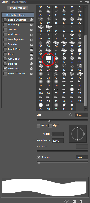
Create a new document at 50 x 50 pixels, and fill the background with black.
Click Edit > Define Brush Preset, give it a name, and click OK. You'll now see a plain square brush in your Brush panel.
Step 3
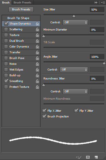
Set the Brush size to 5px and enable the Shape Dynamics effect in the Brush panel.
Apply the following settings to give your brush tip some size and angle variation.
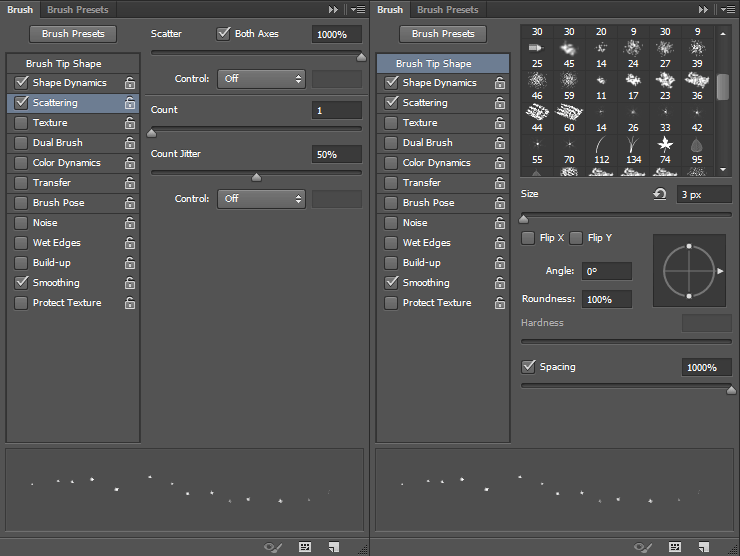
Step 4
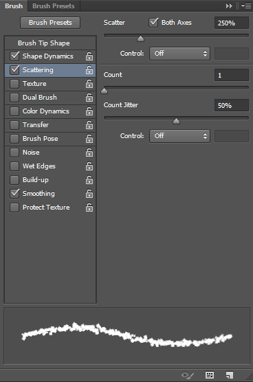
Enable the Scattering settings in the Brush panel and apply the following settings so your brush tip will randomly scatter as you paint.
Step 5
Right click your text layer in the Layers panel and choose Create Work Path.
Select the Direct Selection tool (A). In the top toolbar, click the Path Operations button and choose Merge Shape Components to combine all of your letters into a single shape.

Step 6
Hide your original text layer and create a new, blank layer.
Set your foreground color to white, and with the Path Selection tool still selected, right click your canvas and choose Stroke Path.
In the Stroke Path dialog, use the Brush tool, and leave Simulate Pressure unchecked.

Step 7
Create a new blank layer, reduce the size of your brush to 4px, and repeat the process from Step 6 to stroke your work path again, this time with a slightly smaller brush.

Step 8
Create a new blank layer and reduce the size of your brush to 3px. Set the Scatter amount to 500% under the Scattering settings within the Brush panel.
Repeat the process from Step 6 to stroke your work path again, this time with an even smaller brush.

Step 9
Create a new blank layer, reduce the size of your brush to 2px, and repeat the process from Step 6 to stroke your work path one last time, this time with an even smaller brush.
You should now have 4 layers of sugar crystals in varying sizes.
Pro Tip: You can toggle work path visibility by pressing CTRL + H.

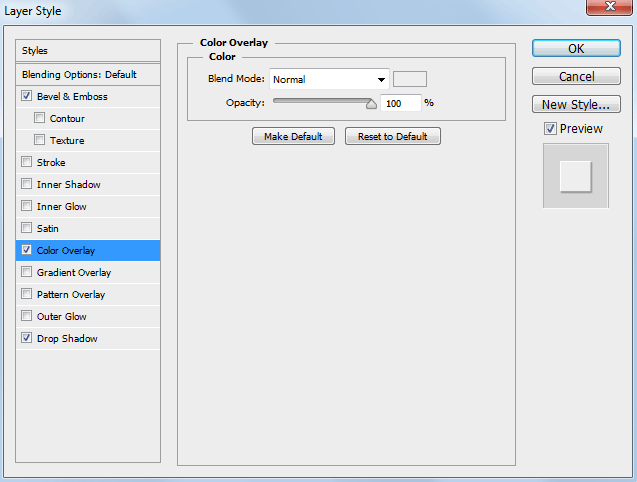
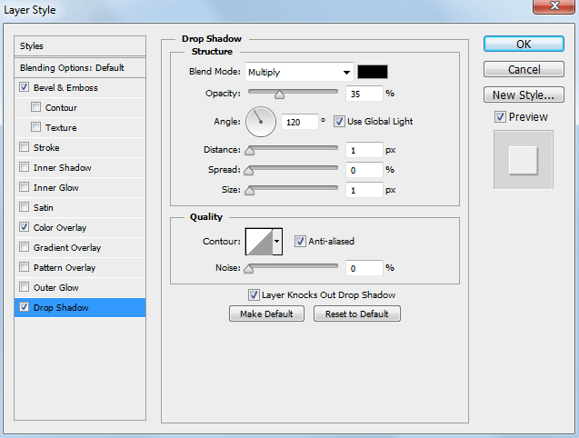
Step 10
Apply the following Layer Style settings to each of your sugar crystal layers.
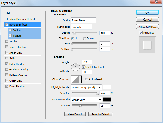
Use the color #EEEEEE for your Color Overlay.

Step 11
Set your brush size back up to 3px, the Scatter amount to 1000%, and the Spacing to 1000% in the Brush panel.
Step 12
Create a new blank layer and paint some stray sugar crystals around the edges of your text.
Apply the same Layer Style settings as you did to your other sugar crystal layers in Step 10.
Pro Tip: You can ALT + Click and Drag effects in the Layers panel to clone them from one layer to another.

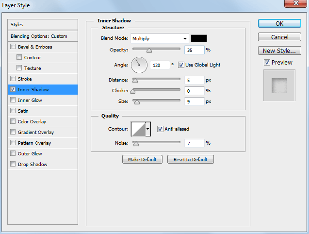
Step 13
Turn your original text layer back on, set the Fill to 0% in the Layers panel, and apply the follow Layer Style settings.
This will add a very subtle shadow to the overall sugar outline.

Step 14
Create some tagline text. We used our very own font, Hensel.
Right click the tagline text layer in the Layers panel and select Create Work Path. Hide the original tagline text layer.
Set your brush size to 3px with the Scatter amount set to 100% in the Brush panel under the Scattering settings.
Create a blank new layer, and with the Direct Selection tool selected, right click your canvas and select Stroke Path.
Apply the same Layer Style settings as you did in Step 10.

Step 15
Create a new Curves Adjustment Layer. Move the middle of the curve down and to the right, then paint in the Layer Mask of your Curves Adjustment Layer with a large, soft brush using the color black so your adjustment only applies to the edges of the image.

Step 16
Click Layer > New Fill Layer > Gradient. Set one color to white, and the other to black, with the opactiy for both colors at 100%.
Set the angle to 120 degrees, and if necessary, click the Reverse check box. We want our gradient to fade from white in the top left corner of our canvas, to black in the bottom right corner.
Change the Blend Mode to Overlay and the Fill to 35% in the Layers panel

Step 17
Create a 400 pixel circle using the Ellipse tool. Move it so it is centered just over the top of the letter "u".
Set the Feather amount to 75px in the Properties panel.
Set the Blend Mode to Color Dodge and the Fill to 10% in the Layers panel to create a soft "spotlight" effect that can easily be repositioned.

Final Image
There's not a whole lot to creating this effect. The quality of the finished product depends on the little details, so don't be afraid to experiment with different brush settings to get the perfect look.

This technique can also be used for other granular substances like salt, sand, small rocks, and more. By playing with your brush settings and layer styles, you can craft a myriad of different effects.
Show us your version in the comments.
Related Items
Grab a PanoPass now and get instant access to all these items and much more.
